2010年11月23日 星期二

Still have a long way to go...

This photo was taken at the bus stop on Prince Edward Road West.  A moody feel of this picture and seems reflect my feelings in these few days.  Everything is in progress!  I have to work harder to K.O. all my works!!!

this week.....Being on Stage!!!!

This week was busy on my show in San Wan Ho Civic Center.  I have been participated in this drama production for 7years.  This year is the 10th anniversary of Joint School Brand New Show.  Here is some sharing of the picture.  Hope you can feel my enjoyment too! :)


New Revoluation of Chinese Ink Painting?

        Traditional Chinese ink painting is usually using a single colour, which is black, to paint the view of the nature.  It focuses on the spirit and shape of the objects rather than focuses on every detail of the objects, e.g. Figure 1 & 2 are the traditional ink painting.


Figure 1 


 Figure 2

        However, I saw some innovative Chinese ink painting recently on the websites.  Refer to the Figure 3 & 4, these are the modern types of Chinese ink painting.  It no longer is restricted to draw about nature.  More details and colour were painted on the picture to enrich the picture attractiveness.  But I still like the traditional styles which can contain more Chinese features in it.

Figure 3

  Figure 4

I like Stop Motion!!

Haha, MV again!!  Here’s come to the “Butterfly Effect” MV of innisfallen, a HK local indie band.  This is a 2D MV by using the stop motion technique in it.  Although it is quite flat and with a single angle only, it still can be a style of doing such MV.  Lots of papers and characters’ movement pictures have to print out to compose this MV.  It is nice!


Fun with LOMO!!

      It is a picture that taken by the LOMO camera.  I like the large contrast of the colour and also the reflection on the lake.  It makes the parallel between the reality and the virtual environment in the lake.


        Special effect is seen in the picture.  The contrast of the light constructs a cross on the escalator in the MTR station.

COOL!!!

        This is a Liquid Lamp designed by Kyouei, a Japanese design company.  This design is simple but artistic.  A liquid red motif, like blood, was bleeding from the top of the lamp.  It is a kind of creative and innovative idea.

The Ting Tings - "Shut Up And Let Me Go" MV

      Another video sharing!  It is the song sung by The Ting Tings.  Actually, I think the filming and editing techniques do add the attractiveness of this MV, or even the song.  In the middle of the MV, numerous of shape created by the human body, and the next scene of the picture were brought by those shapes.  Through different in and out effects, it just like the characters wanted to bring you to other levels of the picture.  It’s interesting!


Anti-Smoke Advertising

        I want to share two of the anti-smoking advertisement that I think is good to all of you.  Many of the anti-smoking advertisement usually stated the drawback of being smoked so as to threaten the smokers.  However, beyond this element need to be told to the viewers, this kind of advertisement can be shown in a more artistic way actually.  Like the picture below, Figure 1 utilize the cigarette ash to create a man was creeping and raising his hand seems asking for help in order to project a image to the viewers that smoking does kill themselves.  For the Figure 2, it is about a cigarette can kill lots of people not only the one who smoke, but also the surrounding people affect by the secondhand smoke.  These two advertisements are using very simply and clear visual to project the meaningful message and long-sighted drawbacks.

Figure 1  The Smoke by lucaszoltowski

Figure 2

EASON's <一絲不掛> MV

I have seen the sand painting on youtube before, but did you ever watch an actor is within the sand painting?  The famous Hong Kong singer, Eason Chan, did this MV for his song.
This MV does impress me a lot when I saw it in the first time.  All the elements in the MV were very simple; it only shows the perfect draw techniques of the artist and also the acting of Eason.  The song is about the fetter of love, the ex-lover does hinder our daily life.  Within the MV, the acting of Eason and sand painting do reflect such feelings under the song.  Yet, all of the movements of Eason is related to the drawing.  The most memorable scene for me is started at 3:24 which a wing was added to the back of Eason.  The picture is like the wing was hatching from the back of Eason, somehow it symbolize the meaning of freedom.  It is a beautiful picture.  Also, with the one shot filming technique, the whole story display in a condition of tension and upsurge.


Explicit LOVE

        Just took this photo randomly.  For me, it is a quite pretty picture as the contrast of the colour, i.e. red and greem, make the “LOVE” more obvious and prettier from the eyes of viewers.  The font of the “LOVE” has the serif which makes the it in a classical way to express an endless love!! :)

"Sweet Dreams" by Kirsten Lepore

This video clip is just very amazing!!!  All of the characters and the objects appeared within the clip were food.  It’s very cute!  The details of the movement were shown clearly.  Different angles of the pictures were used.  Plenty of time and workload have been invested to make this movie definitely.  The overall colour tone of the objects was organized in a harmonious way.  Moreover, although there wasn’t any dialogue in the clip, the body gesture and movement were taken obviously and in details so as to show the messages clearly and effectively.
This video must be taken more than a thousand pictures to convey to an approximate 10 minutes movie.  Doing animation should be a tough task and we have to appreciate them!


The Power of Nature

Have you ever notice the nature?  Everything seems get its rule.  I have went to the Hong Kong Geopark in Tung Ping Chau.  It gives me memorable experiences.  All the rock or the sky owns the natural pattern, which are very attractive and impressive to me.  The rocks get the parallel pit, their position seems being arranged by someone; the cloud on the sky owns its pattern as well.  At that moment, it feels the power of the nature.


Unexpected Good!!!


Are these photos nice?
Actually, they are oil painting!! Haha!!!
These are some of the works by Steve Mills, the American painters.  When he was small, he liked using pencil to draw picture since more details can be shown and this became the characteristic of his paintings.  Later, his paintings were pursue the philosophy of photorealism, caring all the details make his works more like a picture taken by camera.  All the lighting and shadow were painted perfectly, which made the works more concerte.
For more details, you can visit to this website (http://www.stevemillsart.com/).

Man Wan Trip

        Just went to Lantau Island few days ago and visited to NOAH’s ARK and the Ma Wan Park as well.  I have taken a picture of the direction sign and want to share my feelings towards the logo of NOAH’s ARK.  Actually, it combined the wordings of “” and “A”.  It seems quit confused if people cannot recognize the “A” as it is quit unclear.  This design of the whole direction sign is not standardized.  Different patterns and layouts were used in this sign.  The color combination of green and white is also decrease the level of eye-catching as well.


Let's Break the Rules!

This film is directed by Destin Daniel Cretton.  There is less sound and dialogues within the video clips, but the message of it very clear.  Very nice film!  Buddies, let’s break the routine! Break the rules!  Step out and change the world!  Don’t let the strict society to define who you are!


Funny Sharing ~

        This photo was taken at last December as I travelled to The Three Gorges Reservoir with my family.  This sign did catch my attention as the translation of the English seems not so related to the meaning of the Chinese words.  At that moment, we were sightseeing the beautiful view of Chang Jiang River on a ship.  However, this sign made me and my brother laugh as the foreigners may be confused about if they saw “Danger!Stop!”, seems there was some dangerous area in there.  In fact, it was a sign that remind the customers not to cross over the border of the ship or it may lead you to get hurt.
        Is it funny, huh?

My favourite MV of Justin Timberlake

       This is one of my favourite music videos of Justin Timberlake which is called “My Love”.  I extremely like the mono and grey tone of the MV.  It also utilized the effect of lighting that matched the tempo of the song very much.  The dancing movements of the pairs are also very beautiful and graceful.  The proximity of their standing is also very well-organized.  Thus, the picture of the MV is very good at watching.

Can you see that ??? :)


           Can you see those 10 hidden hot & sexy girl in the scene? Do you often miss the opportunities?  This is the TVC produced by the brand called AXE.  It promotes the new shower gel for the man which guarantees to wake you up in order to catch all the opportunities once appear.  It is awesome as the girls were all in body painting, you may miss some of them or you even cannot aware of their existence.  I have been watched for several times to spot out all of the girls.  So, how about you?

Hong Kong Culture by G.O.D.

It is interesting to find some designs that can be expressed my culture.  Actually, a local brand was recalled in my mind once I saw this topic.  The following are the vintage print advertisements of Hong Kong local stylish furniture brand, G.O.D, which is a brand that can really reflect the uniqueness of the culture in Hong Kong.  Figure 1 is an old style local ad in neighbourhood, taking and selling second hand home appliances.  It is very common in the past years of Hong Kong, people will put this stand/cardboard on the street and waiting for the potential customers.  With the hand-writing in red colour on the white board, those words can draw the attention from the viewers though the spacing between each word is low.
Both of the Figure 2 & 3 are the advertisements of selling the computer mouse.  The design of Figure 2 includes the elements like the traditional twelve animals which symbolizing the Twelve Branches used to designate years, the Chinese chess.  Also, the colour of red does reflect the countries of China.  Figure 3 shows that the computer mouse is blended with the china and gingers, which also are the elements of China and Hong Kong.  These print advertisements reflect the daily life of Hong Kong as people like playing Chinese chess and drinking tea and having meal by using the china appliances.

Figure 1

Figure 2

 Figure 3

Laws of Gestalt Psychology

           For laws of the Gestalt Psychology, I’ve found some of the photos/designs to related to this theory.
About the closure, viewers add the missing elements to complete a figure when there is enough information to enable the completion.  Although the head of the soldiers are blocked by the American flag in this picture, the head or the shape behind the flag is still be imagined by the viewers.  It’s kind of closure law of Gestalt Psychology as we will project a virtual image, the head of the soldier, in our mind.  It’s quite funny! 


  Closure

           For this one, it fulfills the law of common fate since we perceived the wordings, “look at me, follow me, read me!” as a unit while they are moving in the same direction.  We read out the sentence easily with no doubt.  The wordings of the sentence are stay still in the same direction while the remaining are tilted into different angle which the viewers will not spot out any meaning of it.
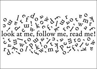
 Common fate


           For the law of proximity, regional or chorological closeness of elements are grouped by our mind and seen as belonging together.  And this can be applied in the following picture.  Actually, this picture is shown by countless dots, they can be meaningless, but we receive it as a picture which a man is riding on a horse and holding a gum since we group the dots automatically by our mind.  Thus, a picture is shown to us rather than just numerous dots with no meaning.

 Proximity